
Designing GIS Systems for Real-World Decisions
Bridging the Gap Between Place, Data and Community
I use GIS to turn real-world conditions into clear, actionable insight.
Through my work in community development, I’ve seen how gaps in data and mapping can limit what’s possible. GIS became a a way to bring structure and clarity by connecting infrastructure, environment, and community to support better decisions.
Today, I design GIS workflows that bring clarity to complex projects, helping teams move from uncertainty to action.
Current Focus
Pure Joy Sanctuary : A Regenerative Neighborhood Demonstration Project
Pure Joy Sanctuary is a 1.25-acre regenerative neighborhood demonstration project located in Spanaway, Washington. More than a residential development, it is an exploration of how neighborhoods can create lasting environmental, social, and economic value by treating housing, ecology, infrastructure, and community as interconnected systems. Learn More
Kat Pèp La ("The People's Map") A community-led GIS initiative that equips residents of Turgeau, specifically those living within a one-mile radius of the future Kay Tita Community Resource Center in Port-au-Prince, Haiti, with the tools to map their neighborhoods, tell their stories, and generate the data needed to shape their future. By combining participatory GIS, community-led field research, spatial storytelling, and resident-defined indicators, the project transforms local knowledge into actionable community intelligence.
Rather than relying solely on outside organizations to define our community's needs, Kat Pèp La enables residents to document the places, relationships, assets, and challenges that matter most to them, making the invisible visible while creating a trusted, living source of knowledge owned by the community itself. This community intelligence platform helps identify local assets, infrastructure gaps, economic opportunities, cultural resources, and environmental challenges, creating a stronger foundation for equitable planning, strategic investment, and long-term neighborhood resilience. Learn More
Explore My Work (Below)
Selected Work
Examples of how I apply GIS across data collection, analysis, and storytelling.
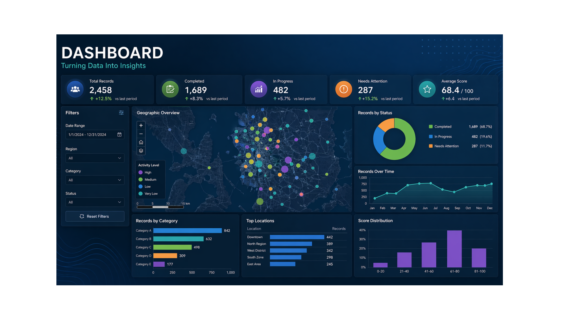
DASHBOARDS - Tools for Tracking and Decision-Making
Interactive dashboards built to help teams track performance, identify trends, and make informed decisions in real time. These tools bring together multiple data sources into a single, clear view making complex data easier to understand and act on.
-
This dashboard tracks small business readiness across key corridors in the Seattle region ahead of FIFA 2026. It combines survey data, spatial mapping, and performance metrics to provide a clear view of how prepared businesses are to participate in upcoming economic opportunities.
The dashboard highlights key indicators such as the number of businesses surveyed, readiness levels, support needs, and overall readiness scores. Interactive maps and charts allow users to explore how readiness varies by location, business type, and operational capacity, including areas like finance, operations, marketing, and technology.
By visualizing where businesses are prepared and where gaps exist, the dashboard supports targeted outreach, resource allocation, and strategic planning to ensure local businesses are positioned to benefit from major events.
-
This dashboard visualizes broadband access and internet reliability across Washington State, combining survey responses with geographic data to highlight connectivity conditions at the community level.
It tracks key indicators such as internet availability, connection type (fiber, DSL, satellite), average download speeds, and frequency of service disruptions. Interactive maps and charts allow users to explore where reliable access exists, where gaps remain, and how connectivity varies across regions.
By integrating survey data with spatial analysis, the dashboard helps identify underserved areas, understand user experience, and support more targeted broadband planning and investment decisions.
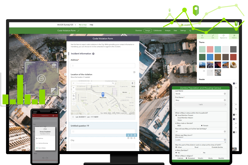
SURVEYS & FIELD DATA - Designing How Data Gets Collected
Structured survey and field data systems built to capture accurate, consistent information from the ground. From form design to mobile data collection, this work ensures that the data feeding each project is reliable and usable.
-
This survey was designed to assess small business readiness across multiple corridors in preparation for FIFA 2026, capturing detailed insights into operations, financial stability, workforce capacity, digital presence, and event-specific planning.
Built and deployed in seven languages, the survey expands accessibility and participation ensuring more representative data across diverse business communities. Structured sections guide respondents through key areas such as revenue patterns, staffing capacity, technology use, and anticipated demand during major events.
The data collected feeds directly into dashboards and spatial analysis, enabling corridor-level insights, identifying support needs, and informing targeted strategies to help businesses prepare for and benefit from large-scale economic opportunities.
-
This Field Maps application is designed to support arborists, developers, and surveyors in collecting detailed, location-based tree data directly in the field. It captures key attributes such as species, health, risk level, canopy spread, and recommended action—creating a structured dataset that can be used for site planning and decision-making.
By combining mobile data collection with GIS, the tool enables real-time documentation of tree conditions, helping teams assess which trees should be preserved, pruned, or removed. The result is a more efficient workflow and a clearer understanding of ecological and development constraints on-site.
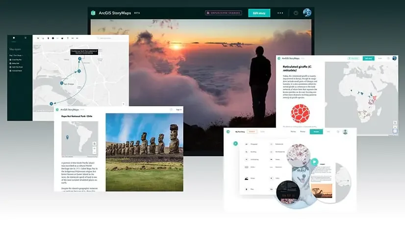
STORY MAPS - Turning Data into Clear, Actionable Stories
StoryMaps that combine mapping, analysis, and narrative to present complex information in a way that’s easy to understand. These projects connect data to real-world context, helping stakeholders see the full picture.
-
This StoryMap explores how Washington’s business corridors are preparing for the 2026 FIFA World Cup by combining survey data, mapping, and spatial analysis to assess readiness across the region. It highlights the scale of opportunity—projected economic impact, increased visitation, and increased demand—while emphasizing that businesses must be prepared to fully benefit.
Through an integrated GIS approach, the project brings together business survey responses, fan zone locations, traffic impact areas, and support resources into an interactive map and dashboard. It introduces a Business Readiness Index that evaluates key areas such as operations, financial stability, digital presence, and technology—providing corridor-level insights into where businesses are prepared and where additional support is needed to strengthen participation and outcomes.
-
This StoryMap examines broadband access across Washington State, combining survey data, infrastructure mapping, and spatial analysis to understand where high-speed internet is available and where critical gaps remain. It highlights the divide between urban and rural communities, showing how access, cost, and infrastructure vary across regions.
By integrating community survey responses with datasets such as speed tests, census data, and federal broadband investments, the project reveals the disconnect between lived experience and officially reported coverage. In some cases, households located just miles apart experience vastly different levels of connectivity, underscoring the importance of more precise, community-informed planning.
WHAT I PROVIDE
End-to-End GIS Systems
I design and deploy complete GIS workflows that move from data collection to decision-making:
Field data collection tools (ArcGIS Field Maps, Survey123)
Spatial data structuring and management
Analysis and readiness modeling
Interactive dashboards and visualization
StoryMaps and narrative reporting
WHO I WORK WITH
Developers & Surveyors
Streamlining site planning with field data tools and spatial analysis.
Small Business & Economic Development Teams
Providing dashboards and insights that support growth and preparedness.
Community Organizations & Advocates
Turning fragmented data into clear, actionable narratives for funding and planning.
GIS is a way to understand place, reveal pattens, and support better decisions.
If you’re building something that requires a deeper understanding of place, data, and community, lets work together to bring it to life.